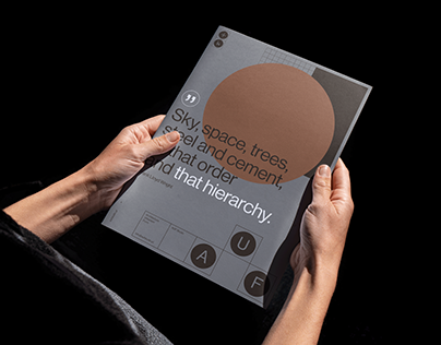
AUF Studio is an architectural studio with over 30 years of experience. They work in a wide range of design, from comprehensive projects, single-family homes, small office buildings, to small architecture and product design.
The brand name AUF consists of three letters, which are an abbreviation for Architecture, Urbanism and Form. The name itself, in its form and sound, is strong and recognizable. That’s why we decided that the AUF symbol would be an integral and flexible part of a larger system, and its simple form would be the best carrier for the brand identity.
The AUF symbol consists of the letters “A”, “U” and “F” incorporated into basic forms such as a square and a circle. Relationships between these individual elements refer to space, order, and project context. The simple form of the symbol allows for a wide range of transformations without loss of integrity.
The post originally appeared on following source : Source link

