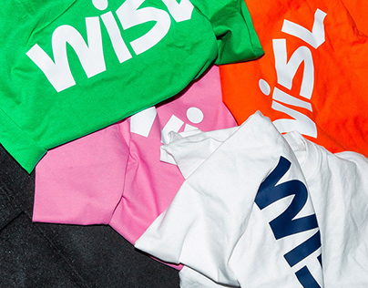
Wisl is a local sports engine inviting everyone to discover like-minded players of any physical activity and do what they all love together. Finding ones should be as easy as whistling. So just wisl. And the right people will be at the right time, ready for your game.
Wisl’s logotype is based on a custom wordmark, where hand-drawn strategic schemes and the trajectories of a bouncing ball inspire the overall energetic characteristic that represents the excitement of playing with a team. It features a stylized “W” brought to the brand illustration to enrich the brand’s visual language. The letter overlaps with illustrated shapes that reflect huddling of the playful mascots. Easy-going and quite naive, these characters are here to reflect multiple aspects of the brand and create various storylines.
Since Wisl is all about people, the visual language also includes photography. It celebrates the joy and camaraderie of sports, depicts human interactions and real emotions.
The post originally appeared on following source : Source link

