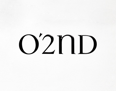
O2nd’s brand identity represents a contemporary sensibility and uniqueness where couture sophistication coexists with casual elements.
The logo type replaces the uppercase ‘N’ with a gentle curved lowercase ‘n,’ expressing O2nd’s pursuit of a free and original attitude. It reinterprets couture elegance in a casual and modern way. Particularly, the lowercase ‘n’ features a gentle curve for the shoulder, conveying a casual mood, while the stem (vertical stroke) on the left side incorporates a modern and sleek look with a right-angle sans-serif style.
To convey O2nd’s distinctive sensibility, the iconic crown symbol, beloved by many customers in the past, is reinterpreted with a modern touch. The previous crown’s intersecting straight lines are replaced with delicate and elegant curves, creating an iconic crown symbol that represents the coexistence of couture and casual sensibilities.
The post originally appeared on following source : Source link
O'2ND Brand Identity Renewal
317
previous post

