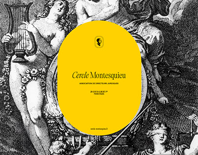
The Cercle Montesquieu brings together women and men, Legal Directors and General Secretaries of private or public companies, associations and recognized institutions who are committed to marrying ideas and action. For the 30th anniversary of the association they wanted to update its branding. In order to celebrate this anniversary and renew its graphic identity I wanted to keep a link between the old and the new. Between past and present. For this, elements such as the engravings, present in the old logo, have been retained, a strong brand color has been proposed and finally the logo has passed into a more statutory serial form. In this idea, the figure of Montesquieu has been preserved, in the form of a medallion, or even by visual engravings. The logotype was composed with serial character (PP Editorial new/Pangram Pangram), in a character that evokes the typographies of the 90s and which echoes the date of creation of the association.
The post originally appeared on following source : Source link
Cercle Montesquieu – Branding
281
previous post

