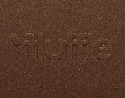
Fluffle brand identity is inspired by a tight hug with your furry friend. It is soft, playful, a bit cute, but elevated and stylish.
Key role plays the typography, we used ES Peak Rounded by Extraset. For the logotype we set kerning extra tight to convey the hug. And when we pushed the boundaries and tightened the hug even more, we got intro the territory of glyphs moving up and down from the axis and form shapes reminiscent of different fog breeds.
Textured papers, emboss and colour accents in packaging were used to match quality of genuine leather accessories. We where looking to create tactile, sensually reach unboxing experience, caring about details, as the dog owner does about their pups.
The post originally appeared on following source : Source link

