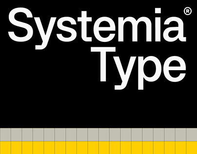
The Systemia project started with a fascination of the VHS and technical design material of the 80’s. We wanted to build a modern, universal typeface that paid homage to this beautiful era.
Technically, Systemia channels the spirit of early Swiss Neo-grotesque typefaces such as Mercator and Akzidenz-Grotesk, evoking the typographic essence used throughout many products of the era.
Similarly the design tips its hat to monospace fonts used at the time, like Frutigers OCR-B, a font widely used for its readability by both machines and humans.
The result is our take on a universal system font, easy to distinguish characters like the I-L-1 and character stems that mix curves with sharp corners help give both a technical and unique feel to a refined grotesque.
The post originally appeared on following source : Source link

