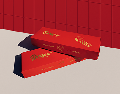
The challenge of the following project was to design a brand for a new chapter in Dauper Biscoitos: the Dauper Cookie Store. The main goal was to create a friendlier and more modern image for the brand’s store, which has been in the market since 1988, conveying its sophistication and tradition in the cookie segment. To achieve this, a new visual language was conceived that balances artisanal aspects – evoking the manual production of the brand’s cookies, with the use of a fluid and handmade typography, along with colors that refer to the ingredients of the products; and industrial aspects – which connect with the architectural language present in the stores and serve as a historical rescue of the brand’s old packaging.
The post originally appeared on following source : Source link
Dauper
247
previous post

