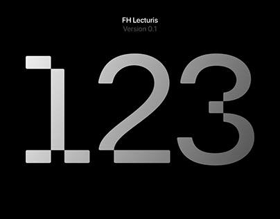
About FH Lecturis
A typeface is a journey that delves into the deepest layers of a language’s visual landscape. Each letter, each line, emerges from the designer’s mental landscape, transforming a text not only into something readable but also into a work of art. FH Lecturis is the expression of a creative dialogue where modernity and tradition intersect.
FH Lecturis, a typeface grounded in the robust foundations of Akzidenz Grotesk but inspired by Wim Crouwel’s contemporary grid system, is more than just a collection of letters?it is a design manifesto. It gracefully exhibits a harmonic dance between classical cuts and rounded corners, navigating the delicate balance between traditional and modern aesthetics.
The post originally appeared on following source : Source link

