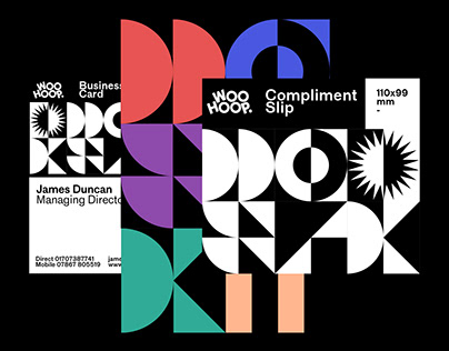
Woohoop is a leading company in the customized packaging sector and for this reason they called us to do their rebranding. Since they work with clients from all over the world, including Coca Cola, Siemens, Instagram Disney and many others, their catalog is obviously immense.
They therefore asked us to be able to divide their vastness of products into subcategories and we, obviously following our unmistakable style, decided that for each category a color and a geometric shape are used which, repeating themselves to form a pattern, give life to an almost infinite number of possible combinations. The shapes and colors are instead mixed together for the web page and presentations, in order to represent the true essence of the company.
The post originally appeared on following source : Source link
Woohoop
258

