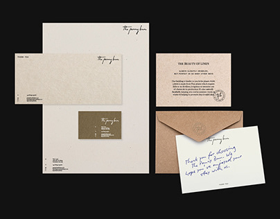
Full brand identity and accompanying collateral for rural Yorkshire pub, The Penny Bun, including logo, signage, stationery, door hangers, welcome cards, guest guides, menus, and info cards. At the heart of the design are warmth, human connection, minimalism, and tranquility. The logotype draws inspiration from a note one of the owners had written during the early planning stages, and this honesty is carried through the design, paying homage to the essence of the exterior smoked cork and emphasising tonal textures and sustainably sourced papers, ensuring the visual language remained both elegant and environmentally conscious.
The post originally appeared on following source : Source link
The Penny Bun
156

