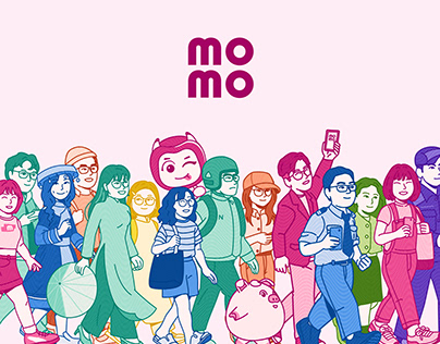
MoMo, Vietnam’s leading super e-wallet, partnered with M – N Associates to redefine its brand identity with a vibrant, layered visual system inspired by the intricate design of paper banknotes. The new branding introduces a dynamic mascot, flexible typography, and a “money layering” layout with four key layers: security, content, visual, and background. These elements combine to create a user-friendly, culturally resonant MoMoverse that emphasizes trust, accessibility, and everyday financial humor, making MoMo an approachable financial ally in the digital age.
The post originally appeared on following source : Source link
MoMo Rebrand
167
previous post

