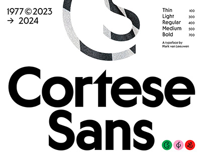
Cortese Sans is a sans serif responsible companion of Cortese, a 2023 reinterpretation of the 1977 classic, Cortez, originally designed by Philip Kelly and published in 1977. While losing Cortese’s characteristic sharp serifs, Cortese Sans maintains the same geometric structure and raw attitude of its predecessor, as well as some signature design elements like its triangular dots.
The typeface features 5 upright styles: Thin, Light, Regular, Medium, and Bold. Its extended Latin character set features over 1.200 glyphs, supports over 75 languages and includes a wide range of contextual and stylistic alternates, stylistic sets to with traditional punctuation & more…
Designed by Mark van Leeuwen
Spacing/Kerning: Sebastian Carewe
Engineering: Sebastian Carewe, Mark van Leeuwen
The post originally appeared on following source : Source link

