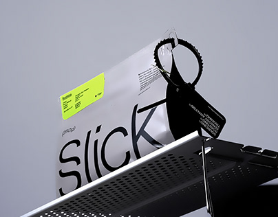
Slick Coffee Roasters’ brand identity embodies the fusion of innovation and sensory experience in the specialty coffee industry. The centerpiece of the branding is a sophisticated, dynamic ‘S’ logo, designed with two overlapping ‘S’ glyphs that suggest motion and upward momentum, resembling rising vapor from a cup of freshly brewed coffee. This design is inspired by scientific diagrams, underscoring Slick’s use of advanced technology in coffee roasting. Accompanying this are linear wave patterns that visually differentiate each coffee type, enhancing the sensory engagement. The packaging features embossed tags to engage touch, complemented by a mono-linear geometric sans serif typeface that emphasizes the brand’s cutting-edge ethos. Overall, the brand identity is crafted to position Slick as a leader in global specialty coffee research and experimentation, appealing to both the senses and the intellect.
The post originally appeared on following source : Source link
145

